New identity for Ulster GAA

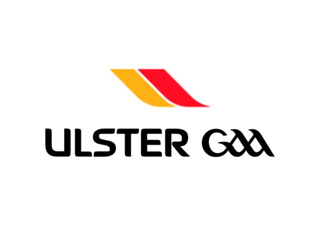
Ulster GAA has unveiled an all-new logo and visual identity as part of a brand refresh, the first update to the brand in almost ten years.
The new branding has been developed with Belfast creative agency, Kaizen, following extensive engagement with key GAA stakeholders across the province over the last number of months.
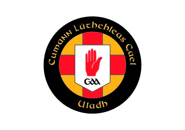
The aim of the project, which includes a new combination mark logo, a new crest, a new typeface and new colour palette, was to redefine brand guidelines and give Ulster GAA a modern visual direction ahead of a new five-year strategic plan due to be launched in early 2024.
With a more digital outlook to marketing, the new identity upweights the intensity of the core amber and red colours of Ulster and introduces a modern font range, ‘September’, which is suited for use in sports marketing.
The new combination mark logo evolves the symbols and typography of the previous logo with the introduction of an abstract ‘U’, which gives the brand a new lease of life through sharp and eye-catching shapes paired with functional, unique type.
The new crest is a modern evolution of the current design, while preserving its heritage through the use of the traditional Ulster flag with Celtic-style typography, in a simpler shape.

The new identity will start rolling out immediately ahead of the upcoming AIB Ulster Club Championships series.
Michael McArdle, Public Relations Officer for Ulster GAA, commented:
“The delivery of the new identity is central to building a stronger Ulster GAA brand, which will be a key objective in our new Strategic Plan for 2024-2028. The project team and our other stakeholders have worked diligently to develop this new look and style, which reflects our commitment to being a modern and vibrant organisation.”
“We look forward to the new identity rolling out across all Ulster GAA touchpoints and channels in the coming weeks, including website, social media, championships, office signage and a new Ulster GAA jersey.’’


